UIC CADA Identity Design
My Design Thinking and Leadership course centered around the re-branding for the College of Architecture, Design, and the Arts (CADA) at UIC, a project that would be driven entirely by the students. The new dean of CADA presented a complex challenge: create a new visual identity of the college that simultaneously complimented the unique qualities of each individual school while folding them into the existing brand of the UIC campus.
On this project I worked with a team of other students in two phases. First, we conducted extensive design research over a three month period. This took the form of many hours of interviews with CADA stakeholders and on-site study of the existing campus culture and visual qualities of the different schools. Then, we compiled and synthesized our research, and developed designs informed by our findings. We collaborated and critiqued multiple design concepts before honing in on a singular identity to present to the college.
This project allowed me to refine my skills in conducting research and acting on feedback from different stakeholders. Through this process I learned a crucial lesson about designing as part of a team; although my concepts were not chosen I was still able to give helpful and actionable input as our class developed and refined the final deliverable. At the end of the year, the school adopted some of our proposals, integrating our suggestions into their branding as soon as one month after the final presentation.
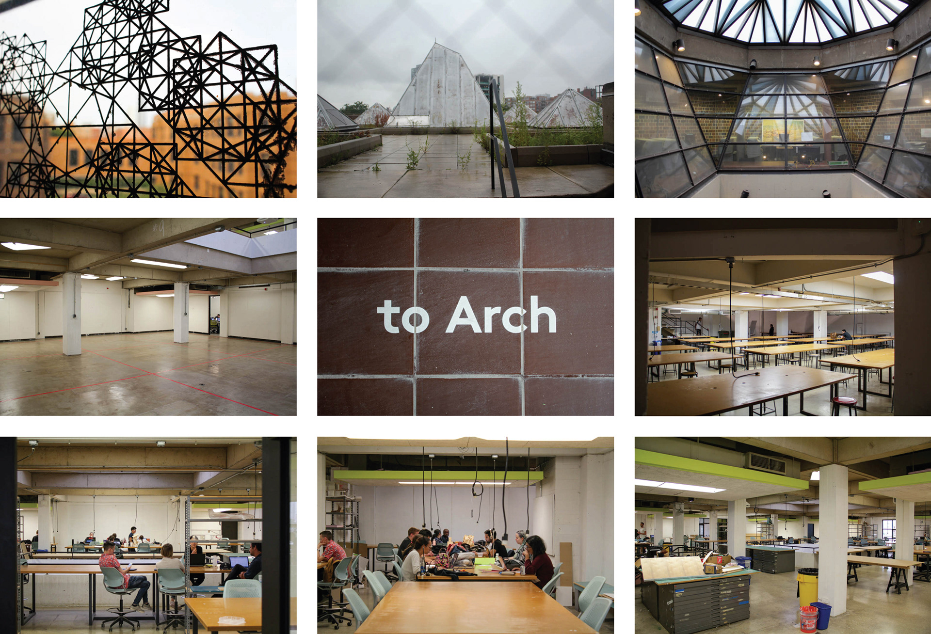
I began my research by taking photos of the space within the architecture building at UIC. My goal was to obverse both the structural qualities of the school and the campus culture to identify themes for moving forward.
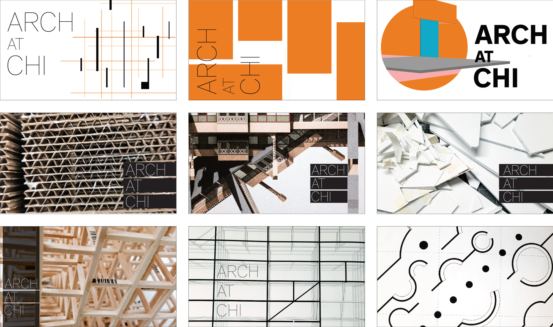
I first started by drawing lines at random (to mimic sketches of floor plans and other drawings), but they just fell flat and had no meaning. I tried incorporating photos of materials used in architectural models, paired with clean san-serif type, to invoke the concept of architecture. I felt this was starting to go in the right direction.
It was from there that I decided to activate the negative space of the pattern photography I had taken of some balsa wood frames that I had seen architecture students work on. Doing so created these interesting shapes that were reminiscent of drawings that I had seen, but I wanted a more fluid system.
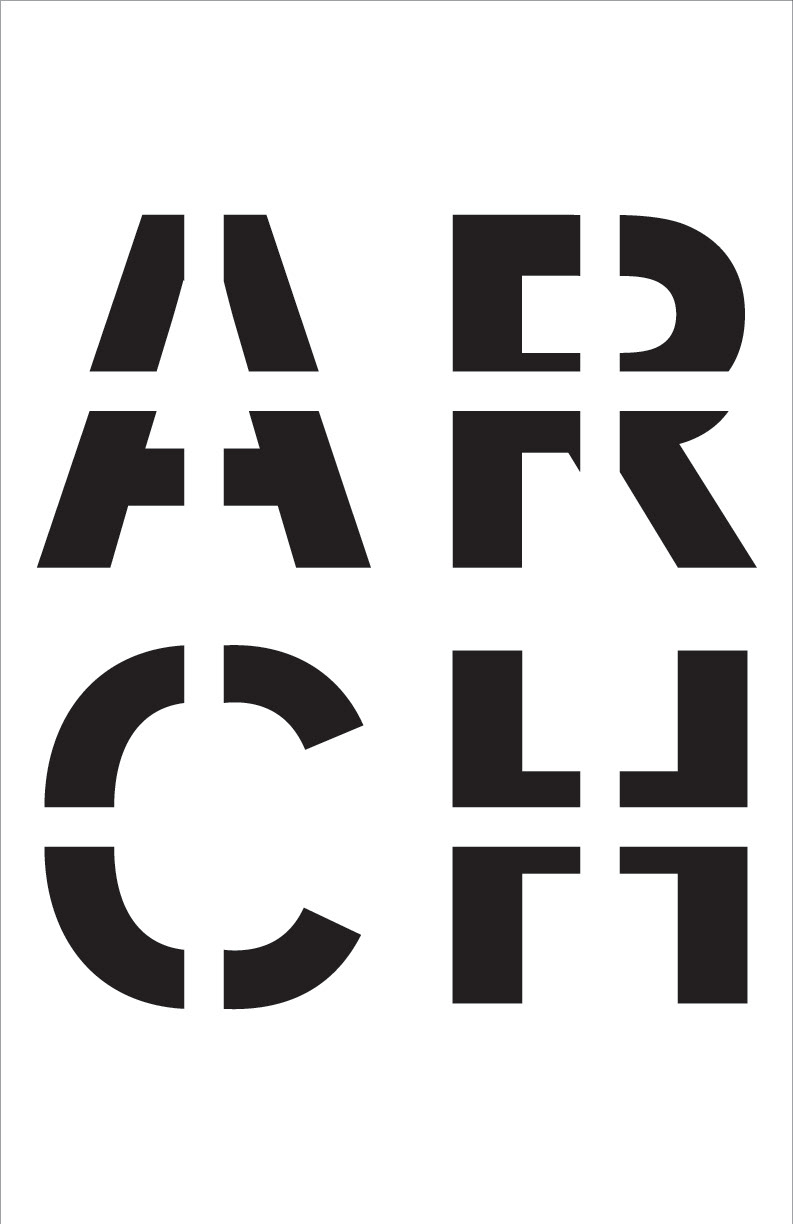
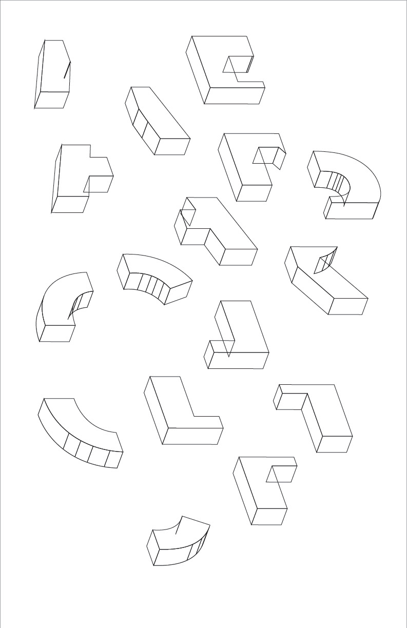
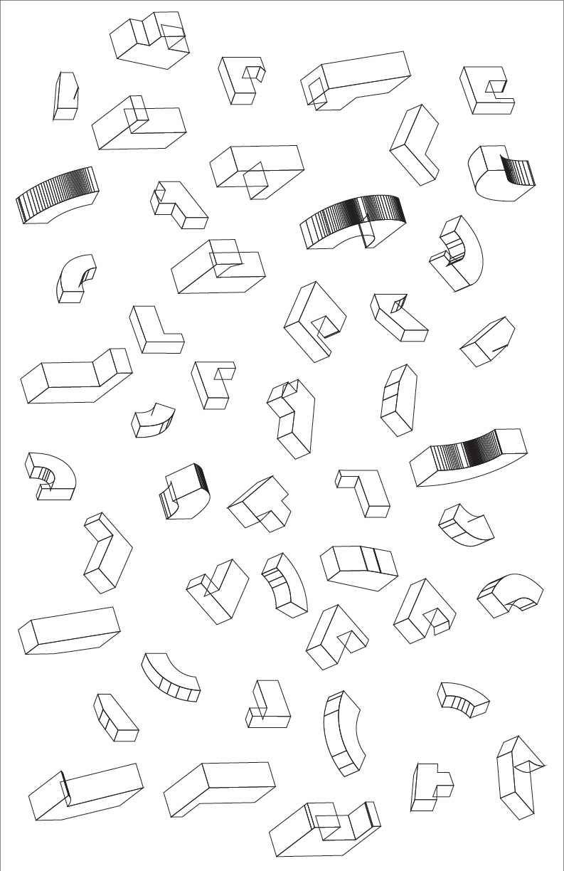
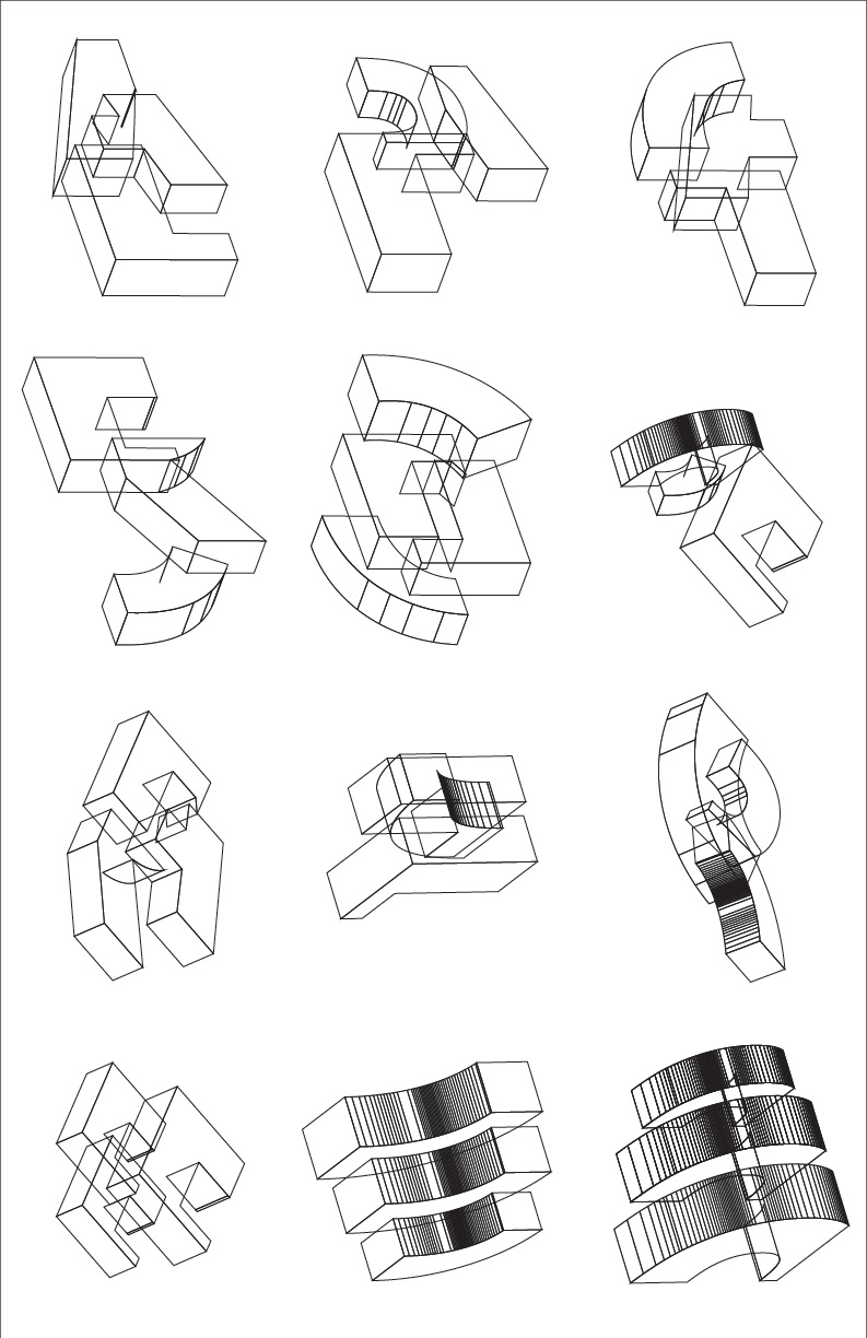
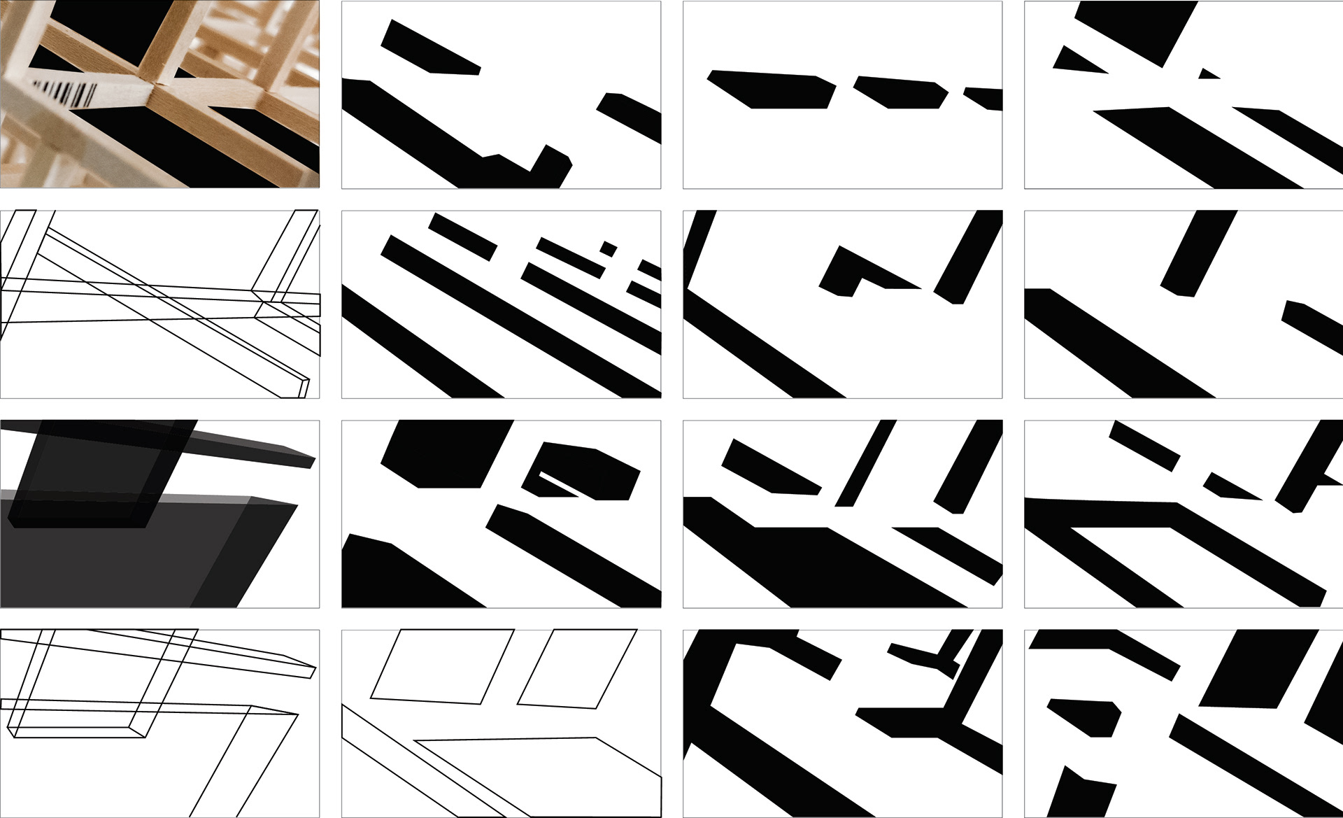
Finally finding the right track I decided to break down the letterforms of A R C H (an abbreviation of architecture that I had) that I had been using throughout my earlier studies and separated each letterform into quadrants. From there I turned them into 3D shapes and tilted them at different angles until I had a small library of isometric shapes. Moving forward I attached the shapes together into different combinations and have these act as a formal element of a visual identity.
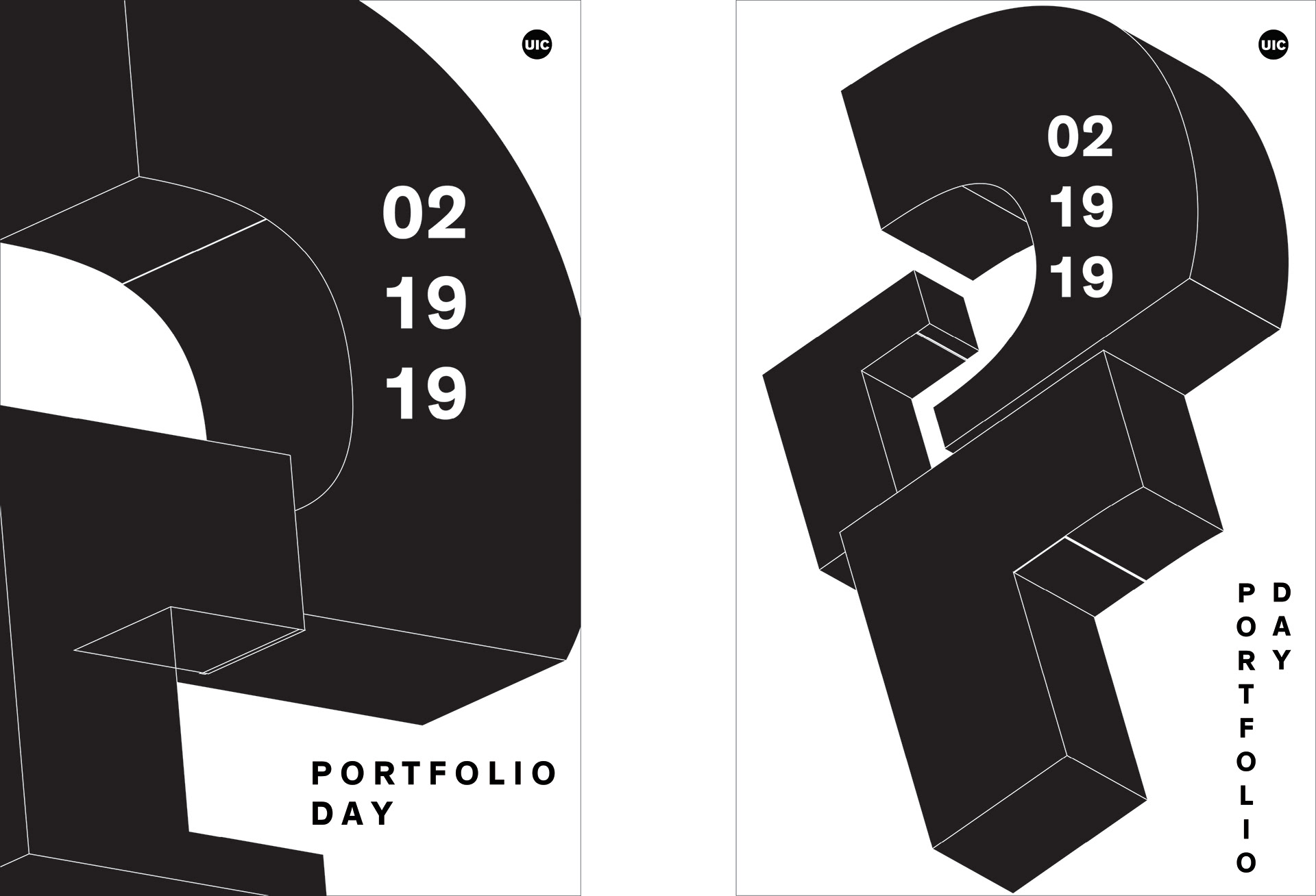
The shapes are both a nod to the isometric forms used in architectural drawings and the concept of the notional studies of architects.